


Enhancing sunlight in Lightroom
+ my trick to enhancing sun rays

I strive to edit my images to show how the moment felt, which may not be a 100% representation of reality and I am OK with that.
I find bright sunshine takes some extra finesse to make it look closer to what I saw. I shoot to preserve the highlights. The brightness of the sun makes that near impossible without leaving the shadows so far underexposed you cannot bring them back. I try to find a balance in the exposure via the histogram to ensure I maximize highlights and don’t kill the shadows.
There is a lot of media saying you should never have underexposed shadows or overexposed highlights …every image should be edited to balance the exposure. While this can work for a lot of images, it is also a rule to be broken. The sun is a ball of burning gas so bright it will burn your retinas …it is not unreasonable to have it blown out in an image. I do, however, find it is important to control what is blown out so it still looks good in a photo.
Sometimes I exposure bracket for the most flexibility, but I don’t do it all the time. There was a point in my photography when I did a five or seven bracket of everything …yes, everything! 😂 I am glad I got over that phase …so many files.
Getting to the point of this article and most likely the reason you clicked on it, here is one method I use to enhance sunlight in my images.
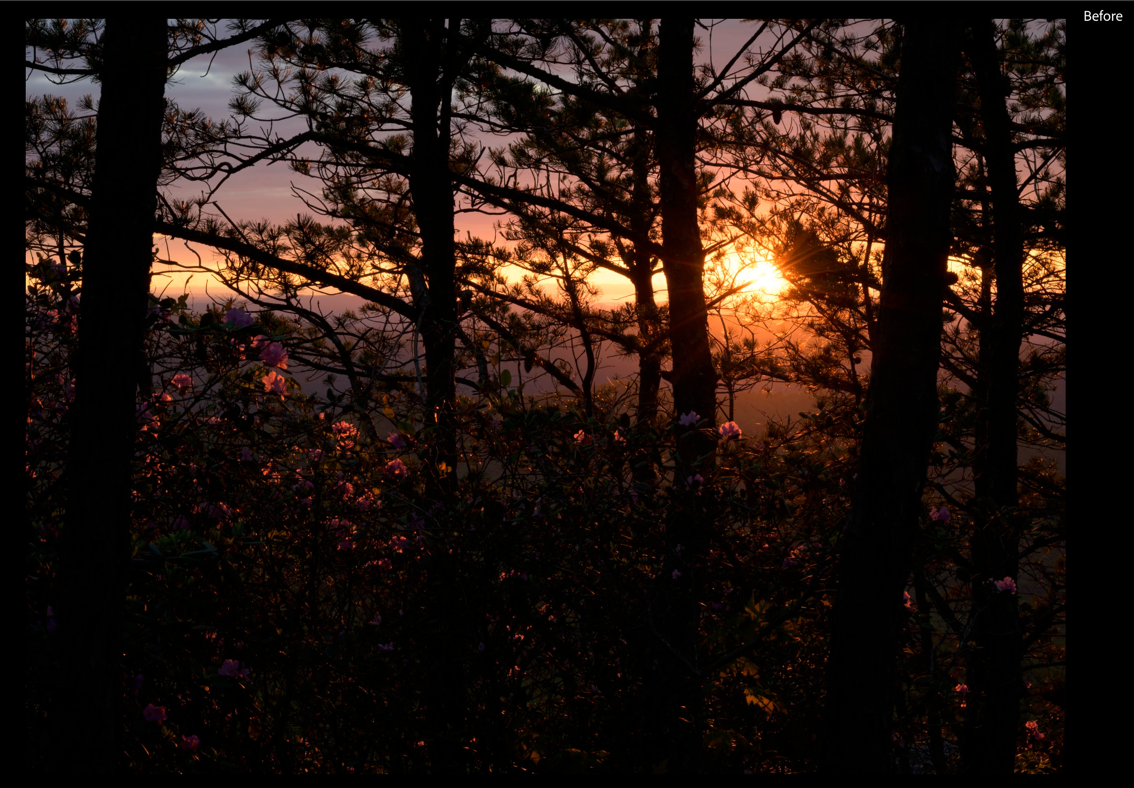
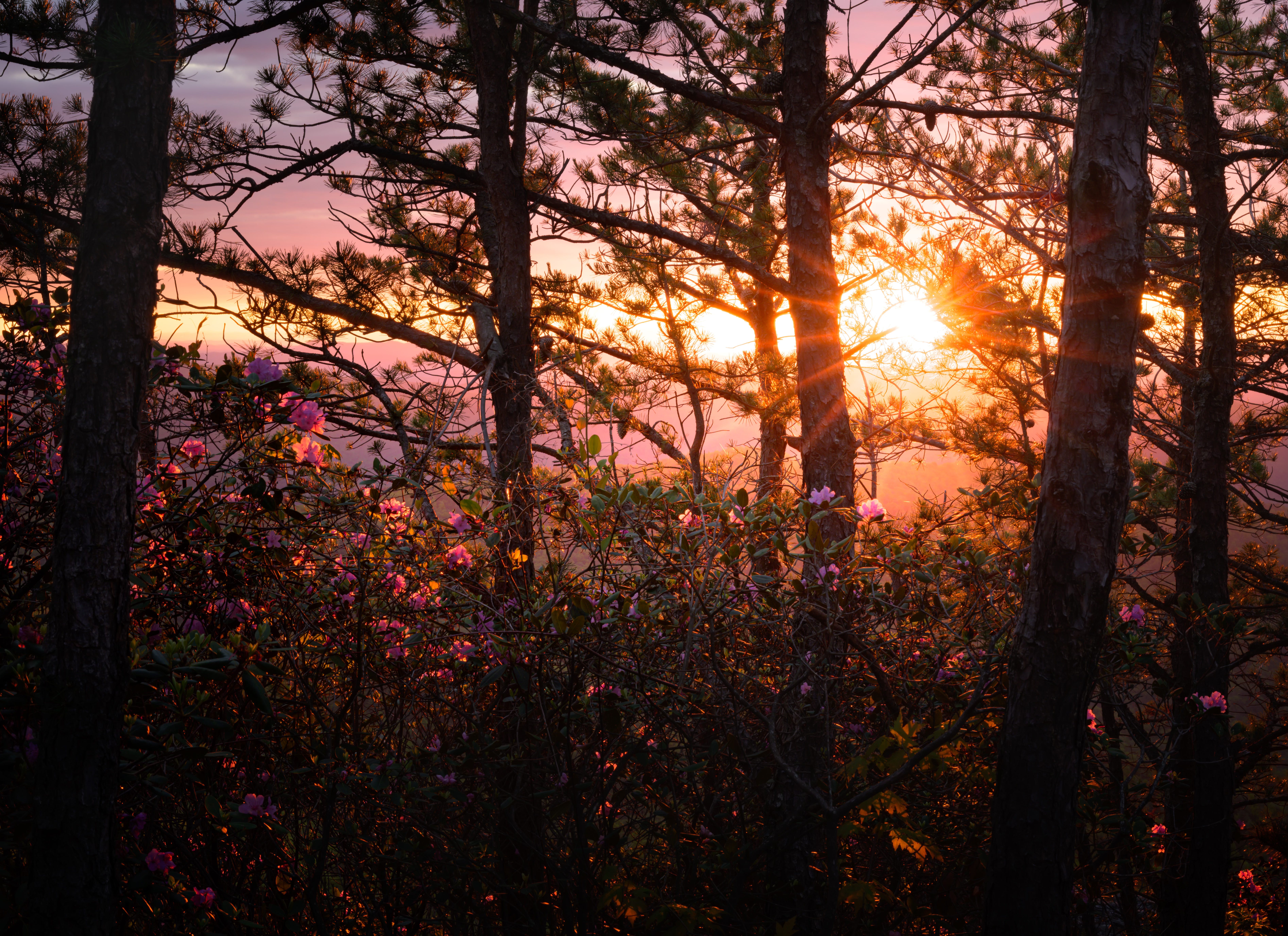
This scene was much brighter in person. The leaves and blooms were glowing, I could see the bark on the trees, and the horizon was flooded with sunlight and I want the final edit to be closer to that.
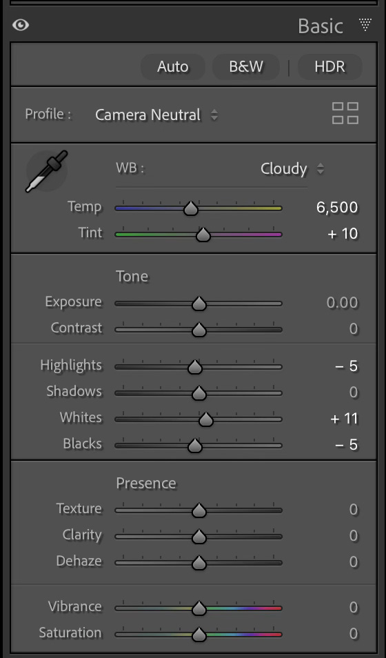
The only change I make to global settings before I use masks is setting the white balance. I typically try the basic settings and found ‘cloudy’ worked well for this one.
I love the masking tools in Lightroom! I do very few global edits anymore. I will come back to those in the end.
Let’s edit the sun.
I start with a large radial gradient with the center reduced to a tiny circle to give me a highly feathered radius.


You can start to see more details like the sun coming through the trees and lighting the flowers and leaves. Next, I move to some smaller details.
Sun rays can be overdone, but I like them in some images …and this is one of those images. I want to enhance the rays without making them look fake. I do this by tracing each ray with a very small brush at 100% flow rate and then put a radial gradient over the top so the rays have a realistic fade.


Now I add the radial gradient over this mask by using the right-click menu and selecting ‘intersect with’ > ‘radial gradient’. Draw the gradient off to the side …if you try to start right on top of another mask it will take you to that mask instead of drawing the new one …so draw to the side and move it where you want and adjust as needed.


Here is a before and after so you don’t have to click around to compare.


Now I move on to the trees which should not be black nor should they be overly bright since we are looking into the sun. I used two masks on the trees.
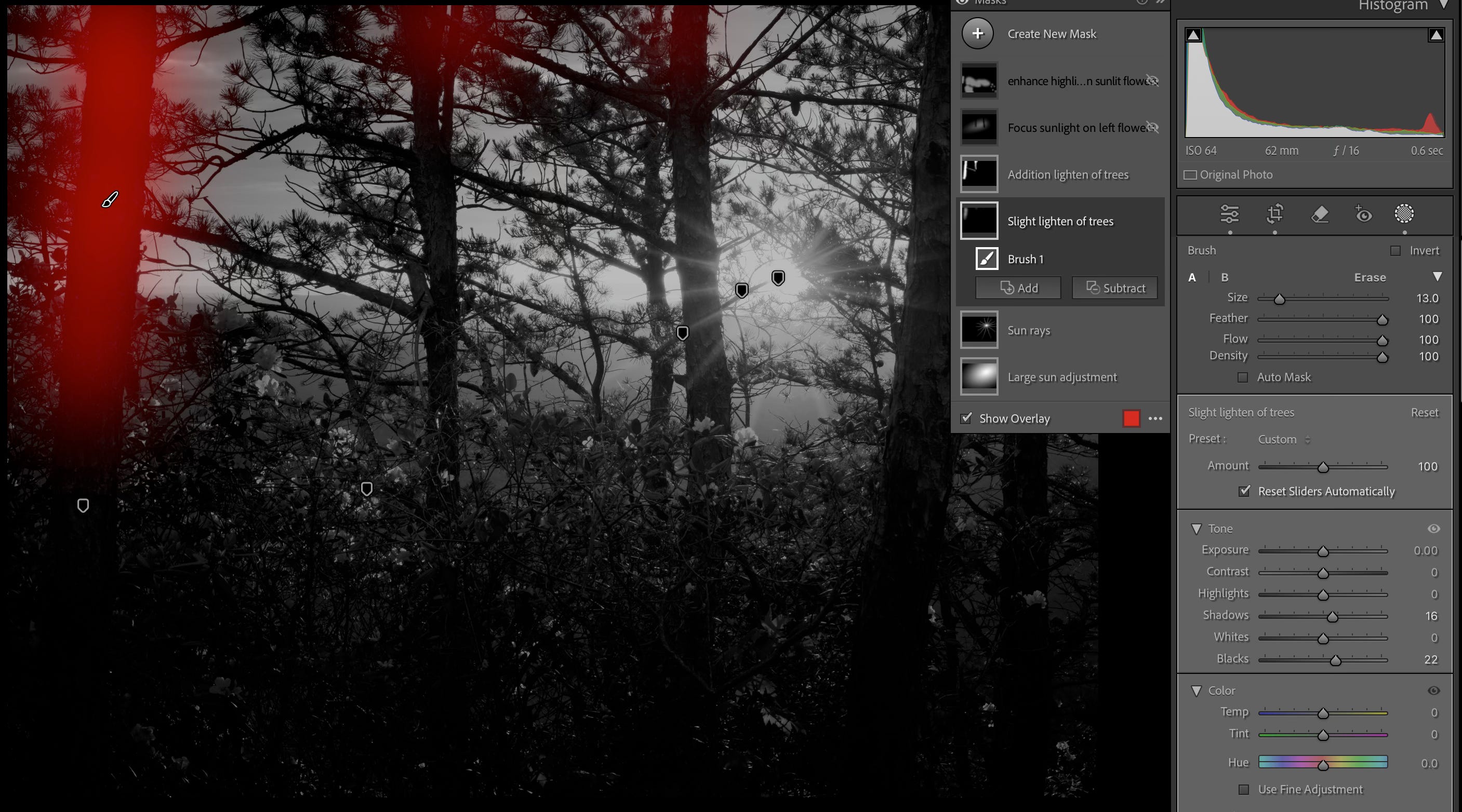
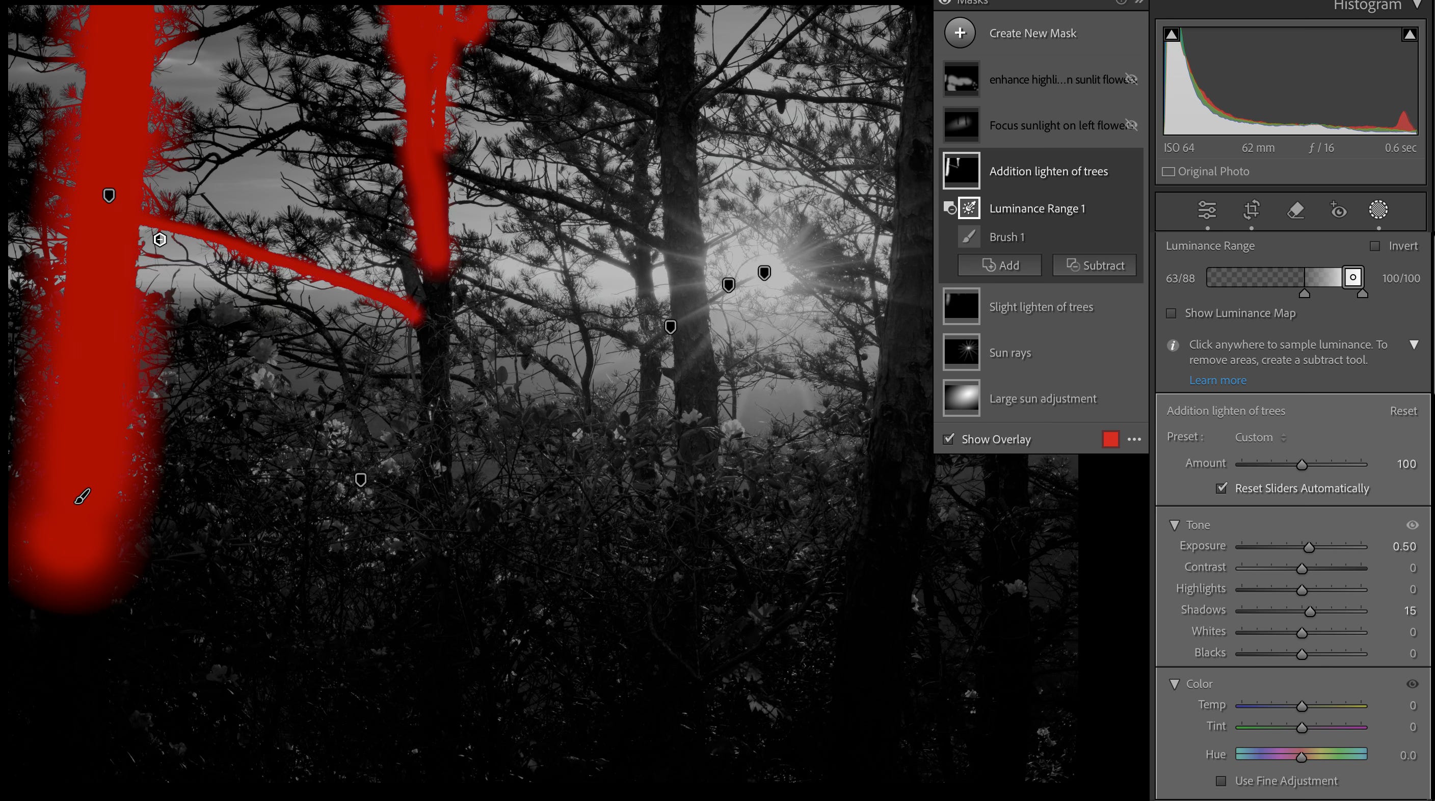
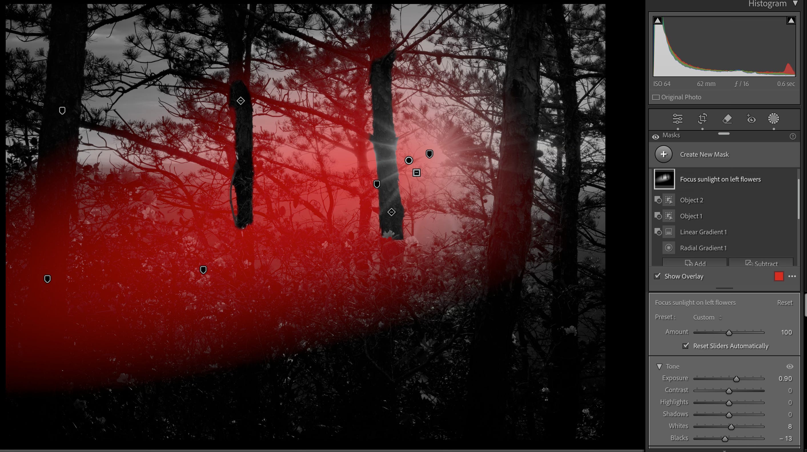
Next, I want to enhance the rhododendrons lit by the sun …mainly the flowers and leaves to the left.
I finish my masking work by enhancing the flowers and bright leaves.

Now that I have the sun and lighting balanced I will refine the image with the global settings. This post is getting quite long, so if you have questions please comment or send me a note.
Here is a quick rundown of each panel:
Crop Tool - Minor change in crop to balance the space on the far right and far left sides to be nearly equal.
Remove Tool - Not used on this image.
Basic Panel
I made a few minor tone adjustments. I rarely use the global “presence” settings these days.

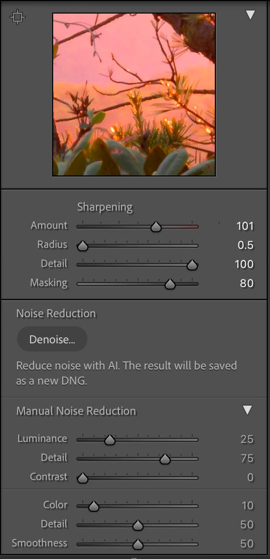
Detail Panel
Right, wrong, or indifferent, this is how I sharpen based on some YouTubes I have watched.

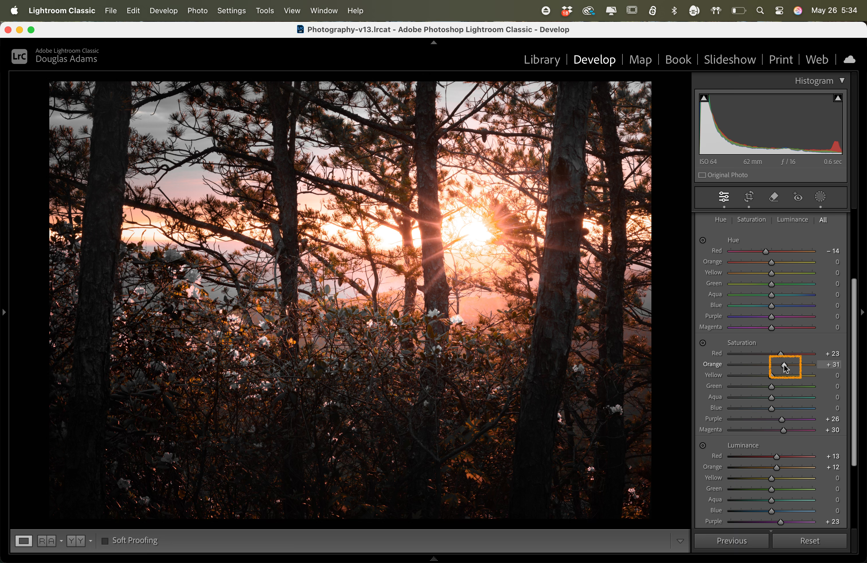
Color Mixer Panel
I spend a lot of time here. I use the HSL panel to work with each color individually. I know the global vibrance and saturation settings may get me 90% there, but I prefer this.

Panels not used on this image with comments on how often I may use them on other images.
Transform - Often used, just not needed on this image
Tone Curve - Rarely used. I never picked up on editing with tone curves
Effects - Rarely used. I use masks when I want a vignette. It gives me more control. I use grain in some of my artistic edits.
Calibration - Often used, just not on this image. Adjusting the saturation on each color range is a nice way to further enhance colors.
Color Grading - Often used, just not on this image.
Lens Corrections - Rarely used. I don’t find much need to use this one.
Lens Blur - Never used it …yet. I may find a use someday.
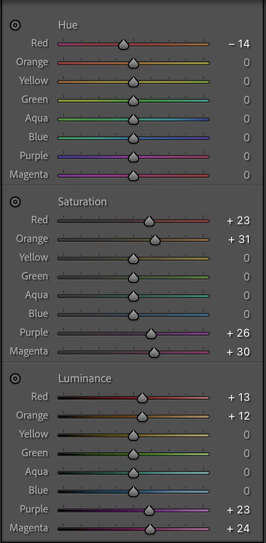
I will wrap up with a brief on the HSL Color Mixer. I go through each color and hold the “Option” key on Mac (Ctrl on Windows …I think) and then move the slider. This focuses on the color you are working with …so you can move the slider to increase or decrease settings for that color. The global sliders affect all the colors the same. This allows you to enhance colors individually giving you a lot more control on the final image.
I enjoy doing it this way, so that is how I do it. I hope you found this helpful in some way. I leave you with the final edited image. Thanks for reading.
Thanks for the step by step. I'm a Lightroom novice, and use far fewer adjustments. I can't call myself proficient at any of them--except maybe cropping. That's a carryover from my B&W darkroom days.